
Billy Seccombe
www.billyseccombe.om
https://twitter.com/wseccombe
Sharon Sprung Paints a Portrait
February 20, 2008
by Louise B. Hafesh
by Louise B. Hafesh
Sharon Sprung, the cover artist for The Artist's Magazine's April 2008 issue, paints the figure from life but positions that figure in abstract fields. A double life is what Sprung admits to when it comes to her art. Her portraits are beautiful as fields of color sometimes heightened with ornament, yet they provoke the viewer into feeling each subject’s soul and guts. Sprung wrestles with the dichotomy between realism and abstraction.
“There’s a beautiful freedom in the mergence of the two that allows me to speak visually to more people,” she says over coffee in a cafe near her teaching gig at the Art Students League in New York City. “I’ve grown to dislike the hard edges and flat planes of the photorealist. I strive to give my paintings the life and energy of modern work, yet suggest the depth and craft inherited from the great tradition of realist painters.”
A gifted and generous teacher, whose classes at the Art Students League and the National Academy School typically have long waiting lists, Sprung gets high praise for her ingenious approach to the class demo, which involves her completing a portrait in sequence during a typical semester.
“Rather than cut into valuable student studio time, on the first day of a new course, I ask for a volunteer who will commit to pose during the regular model’s long breaks,” she explains. ”In that way, the class gets to see me develop a painting from start to finish—including tackling any challenges along the way.”
Nine-Image Painting Demonstration (shown below)
By Ruth Callaghan, student at the Art Students League
 First day: Sprung toned the linen canvas (12x14) with a light, bluish tint. Then, working with a small filbert brush with black paint and a small amount of turpenoid, she sketched a center line and the general shapes. She focused on the planes and the structure of the skull.
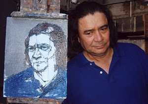 Second day: She defined the drawing with more black, dividing shapes into smaller shapes and always comparing the drawing to the model.
 Third day: She prepared her palette: Payne’s gray, titanium white, yellow ochre, raw sienna, ruby red, permanent bright red, alizarin crimson, cobalt blue, Prussian blue, vermilion, scarlet sienna, burnt sienna, raw umber, burnt umber. ivory black, brilliant yellow light, phthalo green and phthalo turquoise.
 Fourth day: Sprung told her students, while she was working on this portrait, to “make each brushstroke mean something.” She also said, “It’s OK to make a lot of strokes because one is bound to be correct.” Sprung stressed the importance of refining the drawing; she then started the underpainting in blue.
 Fifth day: Using a medium-large brush (No. 6 or 8) and loose arm movements, Sprung used a crisscross movement to cover the canvas in shapes of color. She used violet, black and yellow as she worked on the background. For the shirt, she used Prussian blue grayed with alizarin crimson and white.
 Sprung painted what she called “patches or shapes” in both the light and the dark areas. For the hair, the darkest shape, she broke the mass into shapes of color, as well. She used pure color with a heavier stroke; it looked as if she were pushing the paint into the canvas. Her mixture for the hair was black and burnt umber.
 Sprung told her students never to use ivory black by itself, as it tends to crack. Therefore always mix ivory black with another color. Sprung repeated, “Change colors when the planes (on the face or anywhere else) change.”
 Sprung used the following for the flesh color: raw sienna, cobalt blue, burnt sienna and white. Working with large puddles of color, she made the warm areas warm by adding yellow; for the cooler areas, she added white.

No comments:
Post a Comment
Post a comment below: