Tuesday, September 29, 2009

Steven Assael Demo

In looking on the internet for Steven Assael demo's I came across two great blogs which already feature examples, Art Babel and Art Demonstrations.com (both on blogspot.com), thank you bloggers. I cannot take credit for the content on either blog however they are fantastic when paired together. Below, features not only a step-by-step of Assael's painting process but also .jpgs of two other works. Included is an up close example of his broken color method while the other is simply a head study. Finally, I am including a description of his process that appears to be from a student attending the demonstration. Thank you.


Billy Seccombe
www.billyseccombe.om
https://twitter.com/wseccombe


Excerpt from blog:

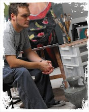
These are notes I took watching Steven Assael paint. Here is a list of the colors I noticed on the palette. There were more, but these are the ones that were used frequently.

List of colors:

Burnt Sienna

Alizarin Crimson

Violet

Ultramarine blue

Prussian Blue

Cadmium green light

Viridian

Burnt umber

Ivory black

Transparent oxide red

Holbein brown pink

Transparent yellow ochre

Yellow ochre

Cadmium red light

Cadmium orange

Cadmium Yellow

Naples Yellow light

Brilliant Yellow light

Titanium White

Steve makes these colors work by blending on the canvas. He would often take a beaten large fan brush and slap in a highlight down the length of an arm in pure white, which would seem too light until he uses mixtures of more or less cad red, ochre and sienna and blends these without white loosely over the same arm. Next he might take a green and work out from the cool halftones in the same way. By this time he had subdued the intensity of the white and by painting all these colors over each other and mixing them together created a beautiful subtle color scheme with lots of broken color and texture. At this point he might restate his lights. This process is very loose with no respect paid to edges of form as these can be established later. Last he would model his darks. This was done with mostly sable brushes. He chose his dark color not for the way it looked but for how it would blend with the other colors already there. For instance alizarin crimson would create a luminous reddish haze when he used it. This would be great for the space between fingers or the transparent flesh in an ear but terrible for a cool blue area around the eye socket. In the cool areas he would often use a purple or a mixed dull greenish color with a bit of umber and a green or blue . When painting these darks he blends out from the darkest point I never saw him block in a chunky dark it was always a soft delicate subtle process where the finish starts to emerge.

Some frequent mixtures:

In the lights often Brilliant yellow light or naples were mixed with cad red, Alizarin or Yellow ochre for warmer colors and the same brilliant yellow could be mixed with a purple or green to cool the light areas. For richer color areas mixtures of naples or brilliant yellow with ochre, cad red or either of the siennas were used.
In the shadows he often would mix burnt siena and cad green, or burnt siena and alizarin for hot areas. Finally for the dark shadow accents he might use pthalo blue mixed with burnt sienna and alizarin.

Sunday, September 27, 2009

Understanding Values

I am constantly searching for ways to development my skills as a painter and one skill in particular is my ability to observe. One of the most important aspects of creating a strong painting is through accurate observation of value progressions. What are value progressions? Value progressions are the small incremental changes from white to black (white being 1 and black being 11) that occur on a scale and the subsequent tones of gray in between. The value scale that I have seen most often or that I use personally is a 9 step value system. I have also seen them as an 11 step system as seen in the picture below. Accurate value progressions are the key to life-like painting as it is based upon small shifts in light and dark that ultimately help to model form accurately.
I have learned recently that a great way to see your value progressions and your painting in terms of value, thus removing hue and saturation; is to observe your piece through a red colored glass or acetate film. These are easily purchased through the internet, camera stores, etc. This technique allows you to see your piece as a series of values as it eliminates color from the scenario. While hue and saturation are important in mixing a color, value is a far more important quality to your decision making process. Afterall, value is what the human eye responds to first before hue and saturation.

As seen below, I have illustrated this approach by using my most recent painting "Burlesque Girl" as an example. On the one hand, you will see the painting as it is, in full color and a second option as observed through a red filter.


Note how the red acetate simplifies the work into value scales and how colors that may appeared different might be much more closely related than initially tought. It is easy to see that while in some instances I believed the color to be working correctly, I may have considered adjusting the values more so to create a richer experience of the work in general. Some forms may have been further rendered including a step here or there to help to describe the form better as it turns in space. Value may also have been adjusted in large areas to create a better separation and compelling composition. Although the girl is obviously the center of attention and the values are generally successful here, had I utilized this approach from the beginning the value shifts might be more subtle and help to describe the form better. The thought here is simple, that while color is important, value is the key to creating realistic, life-like paintings. You may subscribe to this blog by following the link on the right hand side or the page or follow me on twitter at http://twitter.com/wseccombe. Thank you.


Billy Seccombe
www.billyseccombe.om
https://twitter.com/wseccombe

Tuesday, September 22, 2009

Study for "Burlesque Girl"

I created this study during the recent painting of "Burlesque Girl." The dimensions on this particular study are 12x20" and I am very pleased with the outcome of the work. In many ways, I like it more than the finished product as this is a slightly larger portrait than the final painting and at this scale would have made quite an impact. I learned a lot about my approach in this little study such as my handling of soft edges and the building up of multiple layers of paint to produce a rich and interesting surface quality. In all, I wanted to take a moment to share this study with you in hopes that you might gain something by studying it. As always, I would encourage you to become a subscriber to my blog by following the link provided on the right hand side or follow me on Twitter at http://twitter.com/wseccombe. Thank you.


Billy Seccombe
www.billyseccombe.om
https://twitter.com/wseccombe

Friday, September 4, 2009

"John on Sunday" Portrait Demo


This series of photos was taken during a portrait painting demonstration I held at the Salmagundi Club in New York City earlier this spring. I finally have had an opportunity to post the "step-by-step" process of "John on Sunday" which was completed in about a 3 hours sitting. Below outlines my color palette, initial approach and the logic that goes into the basic portrait painting process. Become a subscriber to this blog by following the link on the right hand side of the page or follow me at Twitter http://twitter.com/wseccombe. Thank you.


Billy Seccombe
www.billyseccombe.om
https://twitter.com/wseccombe

I began the demonstration by placing John (seen above) to the left of the canvas with a colored backdrop added for additional color. Two spot lights were included as well; one being to the right of the model while the other was placed directly behind the canvas. This provides similar lighting situations for both the model and the painting.

Here is an initial study I had created of John prior to the painting session to get a better sense of his features and the angle I might use during the presentation.

I began the portrait by breaking down the figure into simple, large geometric forms in much the same way that a sculptor might work with a piece of stone or marble. I am using a wash of Burnt Sienna and French Ultramarine on a medium gray toned wooden panel for this process. By visualizing the figure in this way, it is easier to capture essential angles and relationships needed for accurate observation. It is a reductive process of working from large to small shapes thus solving large forms first before moving onto smaller and smaller sections. These initial forms are the most important part of capturing an accurate likeness.

Once the initial forms have been blocked in, I then moved onto laying in the darkest darks of the portrait by painting in the shadow forms first. This photo illustrates a step slightly further ahead however where I have moved onto painting the mid-tones.

During a break my palette was photographed which is a great example of the colors used and how I work. Reading from left to right beginning in what is the lower left hand corner of the palette and moving around clockwise the colors used are as followed:

-Titanium White
-Raw Umber
-Burnt Umber
-Burnt Sienna
-Alizarin Crimson
-Permanent Rose
-Cad. Red Light
-Cad. Orange
-Raw Sienna
-Yellow Ochre
-Cad. Yellow Light
-Brilliant Green
-Veridian Green
-Cerulean Blue
-Cobalt Blue
-Purple Dioxazine
-Ivory Black

-Medium: 3 parts Mineral Spirits / 1 part Linseed Oil ( in small jar)
-18x24" glass palette mounted on gray-toned masonite

Here I have begun to add in the background color as well as indicating his shirt which helps to anchor the portrait as well as accentuate the flesh tones. At this stage highlights have been painted in and are one of the last and thickest layers of paint.
With a little more fine tuning the final portait is completed.


"John on Sunday'
20x20"
Oil on Panel

Thursday, September 3, 2009

Robert Armetta - Average Flesh Tones

Hot off the presses this morning is the latest and most updated flesh tones palette provided to me by my friend and mentor Robert Armetta. Earlier in this blog you may have discovered a flesh tones palette which outlines color mixtures for basic academic flesh tones. This is the palette I learned on at the New York Academy of Art while studying with Robert. Below, you will find the update to this palette which he asked if I'd post. I will be interested to play with these combinations as I always enjoy learning new approaches to this process. On a side note, he will be appearing in the October issue of The Artist's Magazine so make sure to pick up your copy then. As always, you can follow me on Twitter at http://twitter.com/wseccombe. Thank you.


Billy Seccombe
www.billyseccombe.om
https://twitter.com/wseccombe