
This series of photos was taken during a portrait painting demonstration I held at the Salmagundi Club in New York City earlier this spring. I finally have had an opportunity to post the "step-by-step" process of "John on Sunday" which was completed in about a 3 hours sitting. Below outlines my color palette, initial approach and the logic that goes into the basic portrait painting process. Become a subscriber to this blog by following the link on the right hand side of the page or follow me at Twitter http://twitter.com/wseccombe. Thank you.
Billy Seccombe
www.billyseccombe.om
https://twitter.com/wseccombe

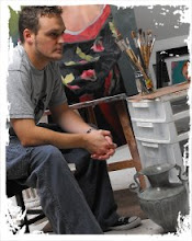
I began the demonstration by placing John (seen above) to the left of the canvas with a colored backdrop added for additional color. Two spot lights were included as well; one being to the right of the model while the other was placed directly behind the canvas. This provides similar lighting situations for both the model and the painting.

Here is an initial study I had created of John prior to the painting session to get a better sense of his features and the angle I might use during the presentation.

 Once the initial forms have been blocked in, I then moved onto laying in the darkest darks of the portrait by painting in the shadow forms first. This photo illustrates a step slightly further ahead however where I have moved onto painting the mid-tones.
 During a break my palette was photographed which is a great example of the colors used and how I work. Reading from left to right beginning in what is the lower left hand corner of the palette and moving around clockwise the colors used are as followed:
-Titanium White
-Raw Umber
-Burnt Umber
-Burnt Sienna
-Alizarin Crimson
-Permanent Rose
-Cad. Red Light
-Cad. Orange
-Raw Sienna
-Yellow Ochre
-Cad. Yellow Light
-Brilliant Green
-Veridian Green
-Cerulean Blue
-Cobalt Blue
-Purple Dioxazine
-Ivory Black
-Medium: 3 parts Mineral Spirits / 1 part Linseed Oil ( in small jar)
-18x24" glass palette mounted on gray-toned masonite
 Here I have begun to add in the background color as well as indicating his shirt which helps to anchor the portrait as well as accentuate the flesh tones. At this stage highlights have been painted in and are one of the last and thickest layers of paint.

With a little more fine tuning the final portait is completed.

"John on Sunday'
20x20"
Oil on Panel
20x20"
Oil on Panel


No comments:
Post a Comment
Post a comment below: